
Menu
Get In Touch

NP-13, Near MP Mall, PitamPura , Netaji Subash Palace

Mail: hello@brandbukket.com

Phone number: +91-9716036467

Working Time

Monday - Friday: 10.00am - 6.00pm

Saturday:10.00am - 4.00pm

Sunday & Holiday: Closed

Menu
Get In Touch

NP-13, Near MP Mall, PitamPura , Netaji Subash Palace

Mail: hello@brandbukket.com

Phone number: +91-9716036467

Working Time

Monday - Friday: 10.00am - 6.00pm

Saturday:10.00am - 4.00pm

Sunday & Holiday: Closed

Responsive Website

Design

Service

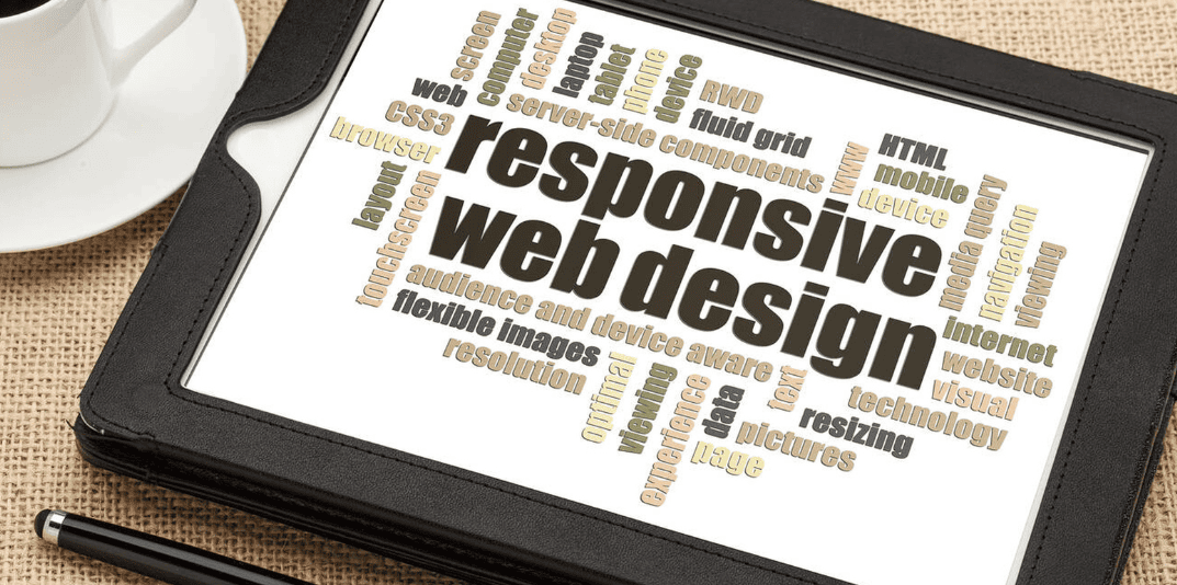
In today’s digital landscape, a one-size-fits-all approach no longer works. With a diverse range of devices, screen sizes, and resolutions, ensuring your website looks great and functions smoothly across all platforms is essential. At Brand Bukket, we specialize in responsive website design that guarantees a seamless user experience no matter what device your visitors are using.

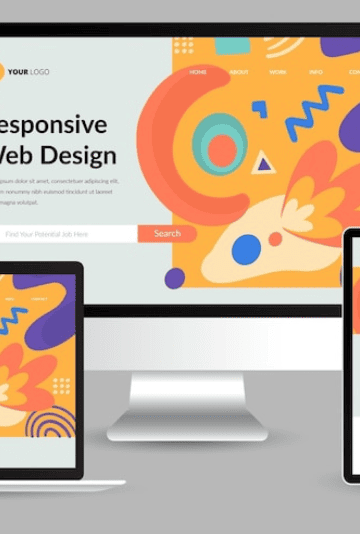
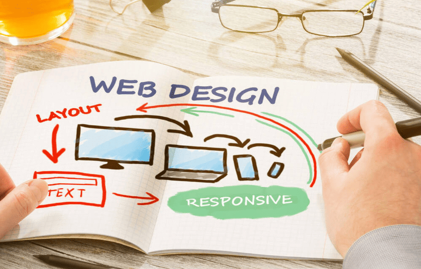
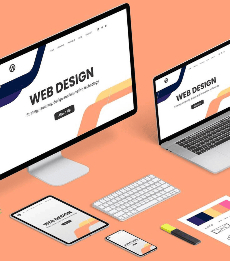
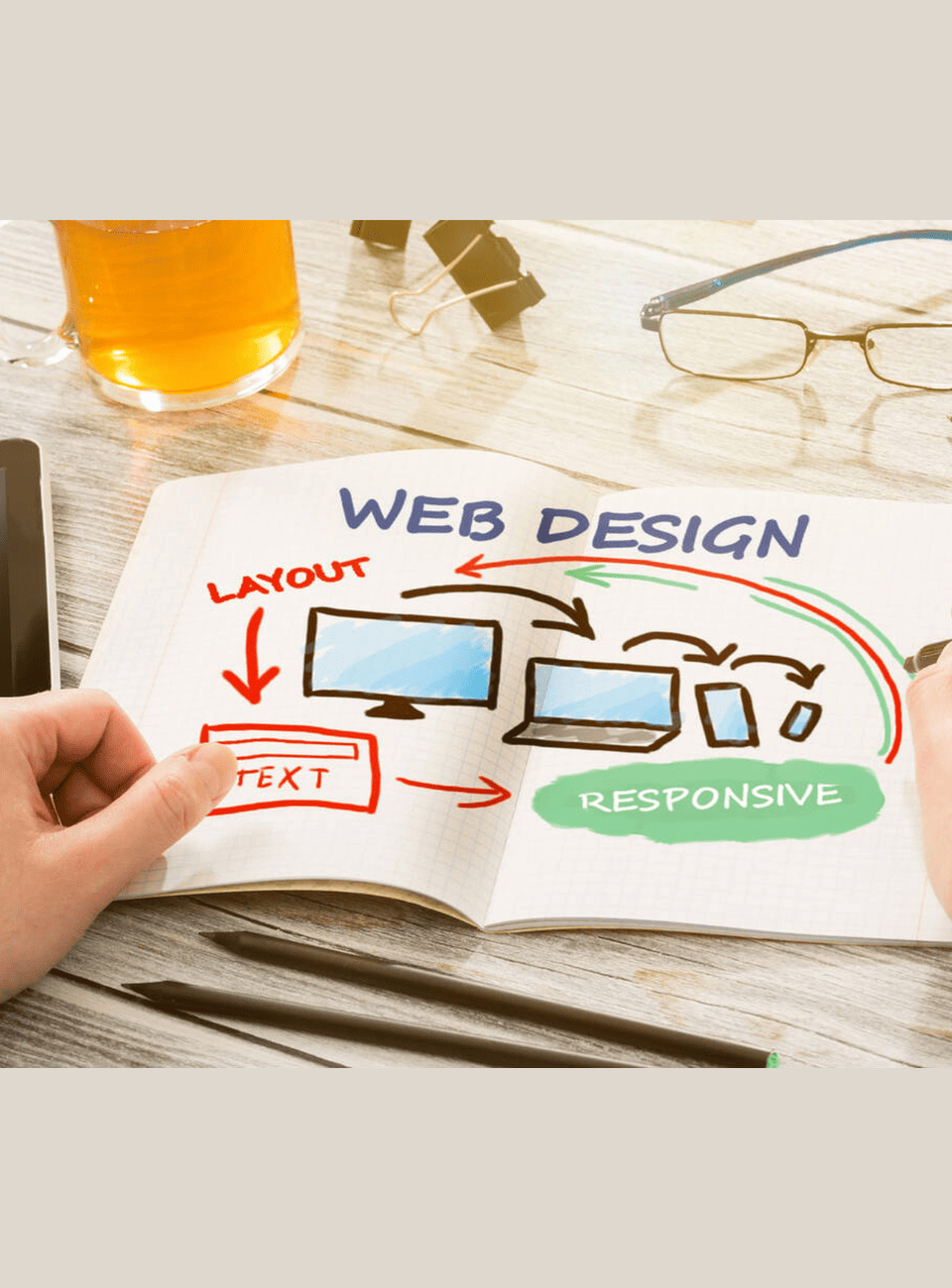
A responsive website automatically adapts to fit the screen size of any device, providing an optimal viewing experience—whether on desktops, laptops, tablets, or smartphones. With mobile traffic continuously on the rise, it’s crucial to offer a consistent, engaging experience for all your users.

responsive-website-design-service

AS AN AWARD-WINNING ARCHITECTURAL PRACTICE, OUR TEAM OF EXPERTS UNDERSTANDS THAT A SUCCESSFUL PROJECT IS RELIANT UPON A PROACTIVE AND FLEXIBLE DESIGN TEAM.

AS AN AWARD-WINNING ARCHITECTURAL PRACTICE, OUR TEAM OF EXPERTS UNDERSTANDS THAT A SUCCESSFUL PROJECT IS RELIANT UPON A PROACTIVE AND FLEXIBLE DESIGN TEAM.

AS AN AWARD-WINNING ARCHITECTURAL PRACTICE, OUR TEAM OF EXPERTS UNDERSTANDS THAT A SUCCESSFUL PROJECT IS RELIANT UPON A PROACTIVE AND FLEXIBLE DESIGN TEAM.

AS AN AWARD-WINNING ARCHITECTURAL PRACTICE, OUR TEAM OF EXPERTS UNDERSTANDS THAT A SUCCESSFUL PROJECT IS RELIANT UPON A PROACTIVE AND FLEXIBLE DESIGN TEAM.

responsive-website-design-service

How We Handle Responsive Website Design Service !

At Brand Bukket, we understand that in today’s mobile-first world, a website needs to perform perfectly on any device—whether it’s a desktop, tablet, or smartphone. Our responsive website design services ensure that your site looks and functions beautifully across all screen sizes and platforms.

Mobile-First Approach
We start with a mobile-first mindset. Given the majority of web traffic comes from mobile devices, we prioritize designing a fluid, intuitive experience for users on smartphones and tablets. This ensures that your site performs optimally on every device right from the start.
User-Centered Design
Responsive design isn’t just about resizing content—it’s about crafting an experience that’s intuitive and easy to navigate. We focus on designing with the user in mind, making sure navigation, content layout, and visual elements are optimized for every screen size and touch interaction.
Flexible Layouts & Fluid Grids
We use flexible grid-based layouts that adapt to different screen sizes. Our design scales fluidly, so whether users are browsing on a large desktop monitor or a small mobile screen, they’ll enjoy a consistent and user-friendly experience.
Adaptive Media & Images
We optimize all visual content, including images, videos, and graphics, to ensure fast loading times and sharp quality across devices. Our adaptive media strategies ensure that large images don’t slow down your site on mobile, and visual elements are resized to fit without distortion.
Cross-Browser Compatibility
Your website will look great no matter what browser your users prefer. We rigorously test and tweak the design to ensure it performs flawlessly across all major browsers like Chrome, Firefox, Safari, and Edge, guaranteeing a smooth experience for every visitor.
Performance Optimization
Responsive design isn’t just about visuals—it’s also about speed. We ensure that your site is optimized for fast loading times, no matter the device. This reduces bounce rates, improves user experience, and boosts your SEO rankings.
SEO-Friendly Design
Responsive websites are favored by search engines like Google, and we make sure your mobile-friendly design helps improve visibility. We implement best practices for responsive SEO, including mobile-optimized content, clean URLs, and faster load speeds.
Seamless Navigation & Interactivity
Responsive design also means ensuring all interactive elements (forms, buttons, menus) are easy to use and navigate on any screen. We ensure touch events are optimized for mobile users, providing a seamless and engaging user experience.
Future-Proof Design
We design with the future in mind. As technology evolves and new devices emerge, we ensure that your site adapts smoothly to any future screen sizes or resolutions, keeping your digital presence up-to-date and relevant for years to come.

Why Responsive Website Design Service matters?

In a world where users switch between phones, tablets, and desktops in the blink of an eye, having a responsive website isn’t just a luxury—it’s a necessity. At Brand Bukket, we know that your online presence should adapt just as seamlessly as your design solutions do. Whether you’re showcasing interiors, presenting creative graphics, or offering marketing services, your website needs to deliver a flawless experience—no matter the screen size.

Mobile is the New Default
With over 60% of web traffic coming from mobile devices, a site that isn’t mobile-friendly is missing out on a majority of potential customers. Responsive design ensures that your website looks and functions beautifully across all devices—smartphones, tablets, laptops, and desktops.
Enhanced User Experience = More Conversions
A responsive site doesn’t just “fit the screen”—it enhances usability. No pinching, zooming, or endless scrolling. When users can easily navigate your portfolio, read about your services, or contact you without frustration, they’re more likely to stay engaged and take action.
Boosts SEO Rankings
Google prioritizes mobile-friendly websites in its search results. Responsive web design plays a direct role in your site’s SEO performance, helping your business get discovered by the right audience. A stronger design leads to higher rankings, which means greater visibility.
One Website, All Devices
With responsive design, you don’t need separate versions of your site for different devices. It’s one website that adjusts intelligently to all screen sizes. That means less maintenance, lower costs, and a consistent brand experience for every user.
Supports Your Digital Marketing Efforts
From Google Ads to social media promotions, most of your traffic will come from mobile users. A responsive website ensures your marketing efforts don’t go to waste. Every click counts, and every visitor deserves a seamless journey from ad to action.
Professionalism That Stands Out
Let’s face it—how your website looks on a phone or tablet reflects your brand’s attention to detail. In industries like interior and graphic design, where visuals are everything, your site should be as polished and professional as your portfolio.
responsive-website-design-service

Our Responsive Website Design Service Includes:

Why Choose Brand Bukket for Your

Responsive Website Design?

Expert Designers & Developers
Our team of expert designers and developers are experienced in creating responsive websites that provide an exceptional user experience on all devices.
Tailored Designs
We don’t use templates. Each website we create is custom-designed to align with your brand identity and fulfill your business objectives.
Future-Proof
We design with scalability in mind, ensuring that your website can evolve as new devices and technologies emerge.
Mobile-Optimized
Our mobile-first approach ensures your website is fully optimized for smartphones and tablets, offering an intuitive and smooth experience for mobile users.
Ongoing Support
After your website is launched, we provide ongoing maintenance and support to ensure it continues to perform optimally across all devices.

Send Information to Receive Consultation.

    Get Started with Your Responsive Website Design !

    Your customers are always on the move, and your website must be ready to engage them anywhere, anytime. At Brand Bukket, we specialize in creating responsive websites that provide a seamless experience across all devices, improve user engagement, and boost your business’s performance online.

    Contact us today to discuss how our responsive web design services can help you reach more customers, improve user experience, and grow your business!

    Prev
    Next